
Title: The Deep Blue Good-By
Author: John D. MacDonald
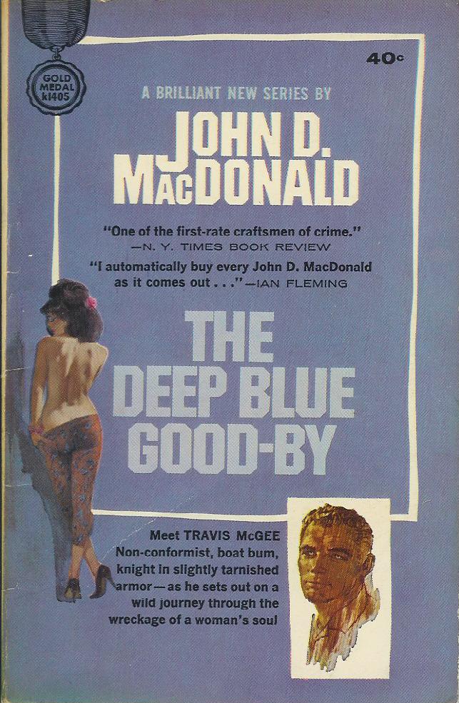
Cover artist: Ron Lesser (unconfirmed)
Yours for: $8
Best things about this cover:
This seems as good a place as any to talk about the demise of the mass market paperback as a species of popular art. Compare this cover to the last two paperbacks I have featured - the late 50's Gold Medals - and you can see instantly some major differences, none of them good from an artistic standpoint (but very good - crucial - from a marketing standpoint). We see the cover art, formerly the showpiece of the paperback cover, now relegated to a mere artistic gesture, an afterthought, as the author's name and Travis McGee's mug get special highlighting. Note how the girl, and even the title, sort of blend into the purplish background, while the author's name and the McGee portrait pop out because of the use of white. Gold Medal is discovering the secret to book merchandising. Art is nice and all, but we are gonna sell books by name recognition and branding - put the author's name front and center and then create a re-usable icon, rather than an original work of art, to represent the work visually. The girl is nice eye candy, but drawn to a scale too small to be truly hot. Next time you see best-sellers out at Barnes & Noble or wherever, note how many (Danielle Steele, Stephen King, etc.) have the author's name superbig, and maybe even a full-page photograph of the author on the back. Authors' names sell books - hot cover art does not (or not as much - it sells books to dorks like me, but there aren't enough me's in the world to keep a publisher solvent).
So advances in marketing mean disasters in artistry. Brand and replicate. Brand and replicate. It's the fast food model of marketing. Consistency. Familiarity. From a book lover's / collector's standpoint, it's all a bit sad.
John D. MacDonald is one of the first real stars - big sellers - of the P.I. genre, and he has his many, many fans, though I'm not exactly one of them. His plotting is good, but he overwrites, and doesn't have an authorial voice I find appealing. This book is the first in the very popular Travis McGee series. Here's a link to a gallery of covers of John MacDonald's other paperback books.
RP


4 comments:
That big J dropped down atop the little AC rocks.
I have a later version of this one. $1.50 cover and the blurbs and the picture of Travis McGee are gone. The girl is shown much larger and it's pretty obviously not McGinnis. I looked in "The Paperback Covers of Robert McGinnis" just to be sure and they don't list him on any version of "The Deep Blue Good-by."
Rex, I'm crossing over from your xword blog just to say I read all the Travis McGee books in a few weeks the summer I was 25 (I think there are 20 or 21 in the series). Not sure why, but I was feverishly into that series--you could read one in a couple of hours and then pick up another one. I tried to read one again a couple of years ago (I'm 40 now) and was kind of embarrassed by having liked the series so much. McGee is a pretentious, narcissistic, faux-Hemingway character, and the author appears to approve mightily of him. Come to think of it, at the time, I probably did, too.
I read all of the Travis McGees voraciously when I was around 14/15, thus giving myself a highly stoic he-man bachelor-pad vision of adult life that took some time to get under control. Like Wade, I took another look recently -- read "The Deep Blue Good-Bye," in fact -- and found the experience pretty embarassing. (I was even more into Robert Parker's "Spenser" books; I wonder what THEY look like now.)
Post a Comment